
In today’s digital age, data plays a crucial role in decision-making for businesses. However, raw data can be overwhelming and difficult to interpret. This is where data visualization comes in.
What is Data Visualization?
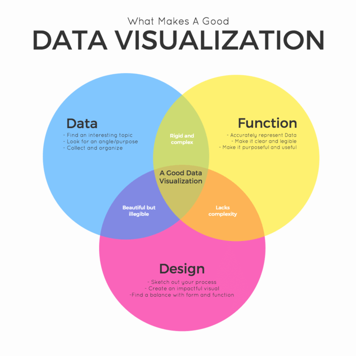
Data visualization is the graphical representation of data to provide insights and help stakeholders better understand trends, patterns, and relationships within the data. By presenting data in a visual format, complex information becomes more accessible and actionable.
The Power of Visual Communication
Humans are visual creatures, and we process visual information much faster than text or numbers. This makes data visualization a powerful tool for effectively communicating insights within the tech industry.
Enhancing Decision-Making
By presenting data visually, decision-makers can quickly and easily identify trends, outliers, and correlations that may not be as apparent in raw data. This enables more informed decision-making and helps drive business growth and innovation.
Improving Data Literacy
Data visualization also plays a key role in improving data literacy within organizations. By presenting data in a visual format, employees at all levels can better understand and interpret complex information, leading to more data-driven decision-making across the board.
The Latest Trends in Data Visualization
With advancements in technology, data visualization tools and techniques continue to evolve. From interactive dashboards to immersive virtual reality experiences, tech companies are constantly pushing the boundaries of data visualization to make insights more engaging and impactful.
Augmented Reality
Augmented reality (AR) is one of the latest trends in data visualization, allowing users to overlay data onto the physical world in real-time. This technology is particularly useful for visualizing spatial data and complex 3D models, providing a new level of interactivity and immersion.
Machine Learning and AI
Machine learning and artificial intelligence (AI) are also revolutionizing data visualization by automating the process of data analysis and visualization. These technologies can identify patterns and correlations within data, enabling more dynamic and adaptive visualizations that can uncover hidden insights.
Best Practices for Effective Data Visualization
While data visualization is a powerful tool, not all visualizations are created equal. To effectively communicate insights, tech companies should follow these best practices:
Choose the Right Visualization Type
Not all data is best represented in the same way. It’s important to choose the right visualization type for the data you are working with, whether it’s a bar chart, line graph, scatter plot, or interactive dashboard.
Keep It Simple and Intuitive
Avoid cluttering your visualizations with unnecessary information. Keep it simple and intuitive, using color, size, and position to draw attention to the most important insights.
Make It Interactive
Interactive visualizations allow users to explore data in a more engaging and personalized way. Incorporating interactive elements such as tooltips, filters, and drill-down capabilities can enhance the user experience and enable deeper insights.
Conclusion
Data visualization is a powerful tool for communicating insights effectively within the tech industry. By presenting data visually, organizations can improve decision-making, enhance data literacy, and unlock hidden insights that drive business success. With the latest trends in data visualization and best practices in mind, tech companies can harness the power of visual communication to stay ahead in today’s competitive landscape.